Visualizing Uncertainty
How can we visualize uncertainty? Adam Hyland’s topic today is a great question for this Valentine’s Day meeting of the Boston Dataviz group, organised by Irene Ros of Bocoup. Irene opens us up by encouraging us to submit talk ideas to the Boston DataVis Community Talks on March 27th. You can submit your talk idea here. She also encourages us to register for the OpenVisConf. Merlin Calo invites us to HTML5 Boston.
Our speaker Adam Hyland is an economist and software developer based out of Boston. He has been working with R since 2010 and when he isn’t writing software, he’s also a Wikipedia editor. Adam is also a collaborator of mine, via Bocoup, on Open Gender Tracker.
We usually do dataviz, Adam reminds us. to carry out a purpose: develop a narrative, inform a decision, or to bring clarity to a problem. The world is a complex place, and we often try to provide clarity. Datavisualisation brings us in contact with that complexity and that clarity.
Adam shows us the Enliven Project’s visualization of false rape accusations. What makes it effective? It shows potential number of underreported rapes, the reported rapes, the number of people who faced trial, and the number of people convicted and jailed for rape. When Slate complained that it was wrong, they defended themselves with what Adam calls a “point estimate.” Enliven had looked at the range of reputable estimates, thought about it, and picked a dot in the middle. This was an okay choice, but it wasn’t an actual reported datapoint. Enliven had effectively a model to decide the number to pick, and they didn’t illustrate the uncertainty in their model at all.
How can we do a better job? Adam assures us that none of us are going to leave satisfied with his answer. One place to start is to ask where people handle uncertainty in visualization. The sciences do it well because they have dealt with statistical methodologies for a century and a half (going back to the Gosset’s work for Guiness or maybe Gauss). Financial forecasters are also good at this, because their money depends on the quality of the visualisation.
Next, Adam shows us Dark Sky, an iphone weather forecasting app. Weather is an incredibly difficult thing to predict. The signals we get are noisy– doppler radar is far from clean– and the models are far from rock solid. Here’s how Dark Sky calculates temperature.
We can’t rely on scientists to tell us how to visualize uncertainty, Adam tells us, because scientists use highly specialised techniques to convey information to their professional peers. They’re little help if we care about communicating with a general audience. Adam shows us an incredibly complicated scientific dashboard and tries to show how confusing it is. He’s successful. As my brain melts, I’m tragically stuck in the middle of a row, unable to reach the pizza table for a power-up.
What is Uncertainty? Adam tells us about three kinds of uncertainty. Stochastic uncertainty happens when you have an uncontrolled dataset and have to reason about it. Model uncertainty, often called model error, occurs when you have reasoning about relationships in your data. You may think that two things are correlated, but a lurking third variable may trip you up. We have the best visual language for the third category, uncertainty about the future.
Stochastic uncertainty occurs when we have dispersion in our data, if we’re drawing from a sample. Adam shows us an opinion poll from the Milwaukie Journal-Sentinel. The chart shows the margin of error at the bottom of the chart. This is the standard presentation for single opinion polls, and it’s incredibly hard to know if the poll supports the conclusion. Even the error margin doesn’t include all of the uncertainty within a model.

Adam shows us the Huffington Post Pollster API, which shows a regression line across a large number of opinion polls. By showing the individual datapoints, HuffPo shows us the dispersion in the data. The regression line also helps reader infer estimates. What’s bad about it?
Political stats writer Nate Silver shows uncertainty really well. Nate was an economics student at the University of Chicago who went into consulting and also did analysis of baseball games. Nate blew away everyone else during the 2008 primary and was recently bought by the New York Times. Nate shows the variation over time and from state to state. Nate repeats his models thousands and thousands of times and shows the distribution of possible outcomes across thousands of runs. His technique doesn’t give you a confidence interval.
Not all of us have control over the models we’re using. How can we think about stochastic uncertainty? Adam starts by showing us boxplots, a one-dimensional measurement of the dispersion of data which shows the dispersion of most of the data. By convention, R also shows datapoints which fall outside of the box. Boxplots are especially good because they’re mostly distribution agnostic.

Adam next shows us a violin plot, “two-dimensional kernel density estimators.” If you cut a violin plot in half and lay it on its side, you see the shape of the distribution.
Adam reflects again on the Huffington Post poll API plot and shows us a boxplot version of the Obama favorability ratings. His version makes the time difference in distribution much clearer. (sorry, I didn’t get a photo)
Does this actually tell us more about uncertainty? The opposite of good statistics isn’t no statistics, it’s bad statistics, he tells us. When making estimations, we should pick and appropriate estimator and be able to show how we do it.
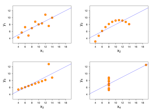
We might object that we’re not modelers. Adam argues that we’re always making judgments and shows us Anscombe’s quartet, four datasets that are identical when examined using simple summary statistics: mean, variance, correlation, and linear regression.
If we’re not careful when creating data visualizations, Adam tells us, we can end up with very very unhelpful results.
Adam points to a variety of other approaches of visualizing uncertainty: contour plots and rug plots. These techniques, unfortunately, make it very hard to present a clear answer.
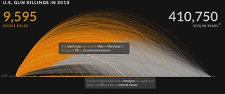
The tension between clear answers and uncertainty isn’t one we can solve tonight. What we can do as designers is try to contribute to the visual language of uncertainty. Adam shows us a visualization of US Gun Killings, which tries to line up life expectancy with aggregate data about gun deaths, creating a persona for each datapoint. Is it okay to present fictional personas? Adam thinks this kind of artistic license is acceptable when you’re aiming for impact.
Model Uncertainty Adam shows us a chart of the traffic received by a podcast. Then he shows us the messy data used to create that chart. We often think that the “web request” is a single thing, but for something like a podcast, a single request is created from many requests. The line graph is not a good representation of the data that comes in. Adam shows us a graph of “the long tail of multi-part requests.”

Forecast Adam shows us Amanda Cox’s remarkable 2010 project on US Budget Forecasts, Compare with Reality. This is cheating, he says, because none of us has access to a time machine. Nevertheless, it’s a great illustration of the challenges of showing forecast confidence.
“Timeseries models of confidence get very complex very quickly and are way beyond my pay grade,” Adam tells us. One approach involves showing error bars. Another involves “bootstrapping,” running the models many many times and showing all of the outcomes.
When visualising uncertainty, there aren’t any easy tricks. Adam wraps up by encouraging us to push the visual language. One way to do that is to use more and more box plots, to can expand public visual literacies of uncertainty. Another way is to continue asking these questions, finding new and creative ways to present uncertainty clearly. Finally, we should talk about it more often– finding, sharing, critiquing, and praising each others’ work.
An addendum: in the discussion, Lynn Cherny points us to a beautiful post on visually-weighted regression on the R-Bloggers site.

blog comments powered by Disqus